Why 404 Pages Matter More Than You Think
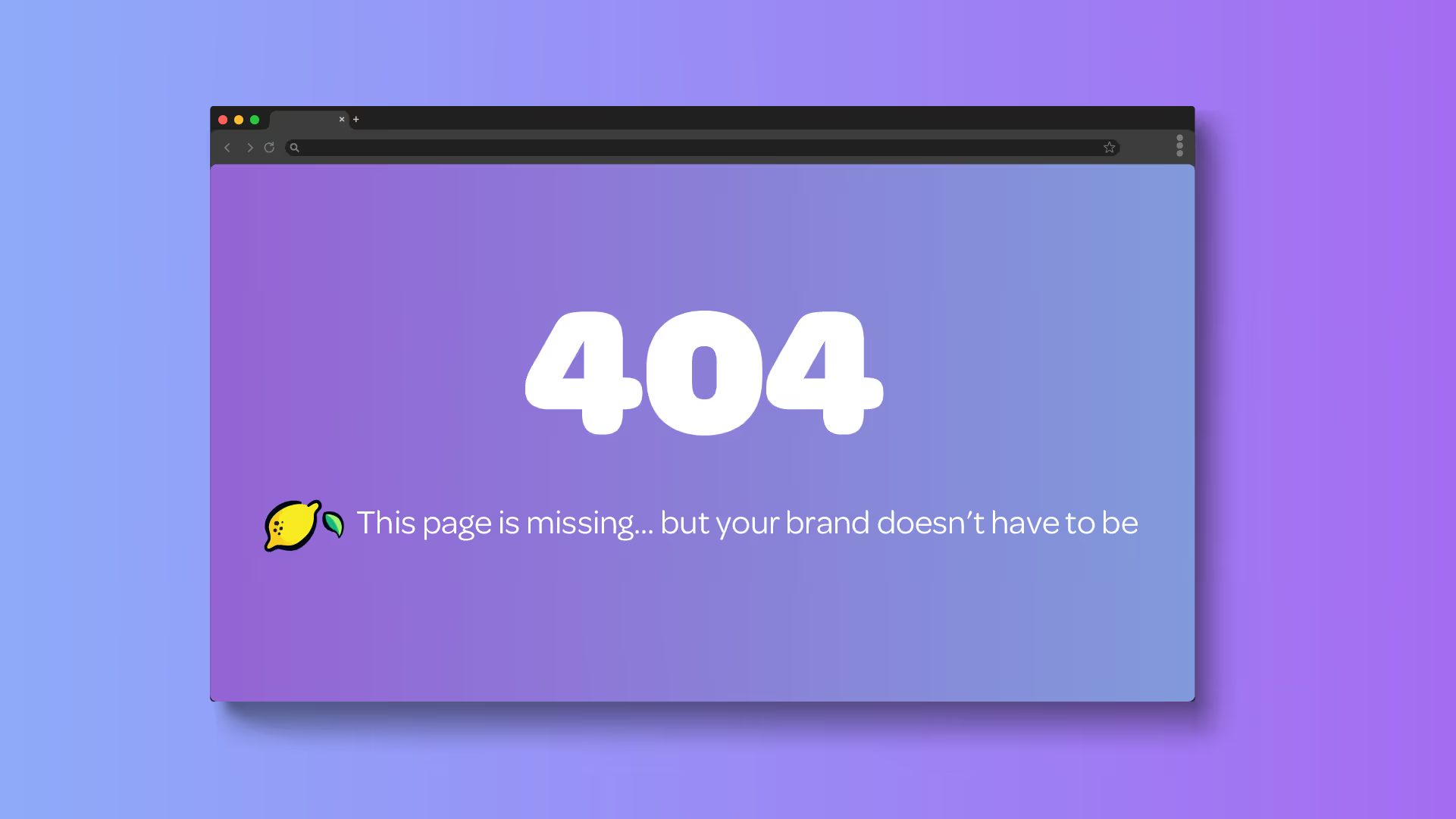

Let’s be honest, nobody wants to land on a 404 page (basically an error page on your website).
When you hit a 404, it usually means something went wrong: a broken link, a mistyped URL, or a page that no longer exists. But when someone does land on your error page, there is an opportunity we don’t want anyone to miss.
Because a little-known secret we love to share, a well-designed 404 page can turn frustration into delight, keep users on your site, and reinforce your brand in a way most pages don’t get the chance to.
First: What Is a 404 Page?
A 404 page appears when a user tries to access a page that doesn’t exist. It’s essentially your website saying, “Hey… we couldn’t find that.”
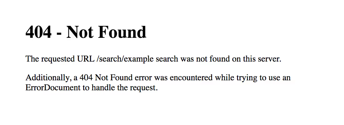
The default version? Cold. Technical. Unhelpful. But a custom 404 page? That’s where personality comes in.
Why 404 Pages Are Important
1. They Keep People From Bouncing
If someone hits a dead end and there’s no clear next step, they’re gone. A good 404 page redirects that energy, sometimes literally by guiding users back to your homepage, services, or other key pages.
2. They Reinforce Your Brand
This is one of the only places on your website where you can break the rules on even the most serious of brands. Here, you are able to use humor and humility as your friend by admitting there has been an error and trying to help.
3. They Build Trust (Even When Things Break)
Mistakes happen. Links break. But when your site handles it smoothly, it shows users you’ve thought through the full experience and not just the polished parts.
How to Make a 404 Page Actually Fun
Use Humor (But Keep It On-Brand)
A clever line or playful message can instantly shift frustration into a smile. Just make sure it fits your voice, but have a little more fun than normal to keep things light.
Tie It to Your Industry
Some of the best 404 pages connect directly to what the business does. It makes the experience feel intentional, not generic.
Add Visual Interest
Don’t just say 404 and point people back home. Utilize your toolbox to incorporate illustrations, animations, bold typography, etc.
Always Include a Clear Next Step
Fun is great. But function matters more. Always give users a way out:
- “Go Home”
- “View Services”
- “Contact Us”
Don’t Overcomplicate It
This isn’t a full landing page. Keep it simple, focused, and easy to navigate.
Real 404 Pages We’ve Created
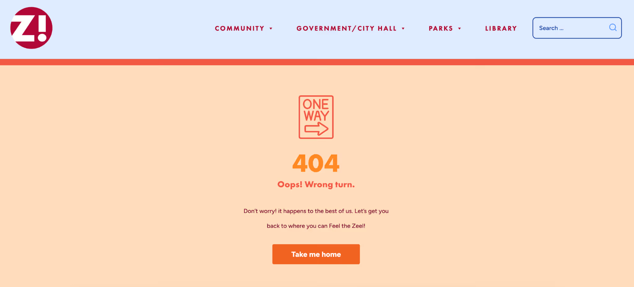
City of Zeeland
A clean, friendly approach that keeps things light and approachable. We wanted the one-way sign to make the error feel more like a quick detour than a dead end.
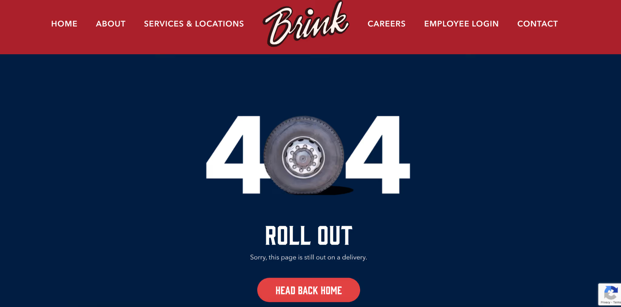
Brink Farms
Brink’s entire brand is built on hard work, logistics, and getting the job done. It was important to make the 404 feel like an extension of their day-to-day operations instead of a disruption.
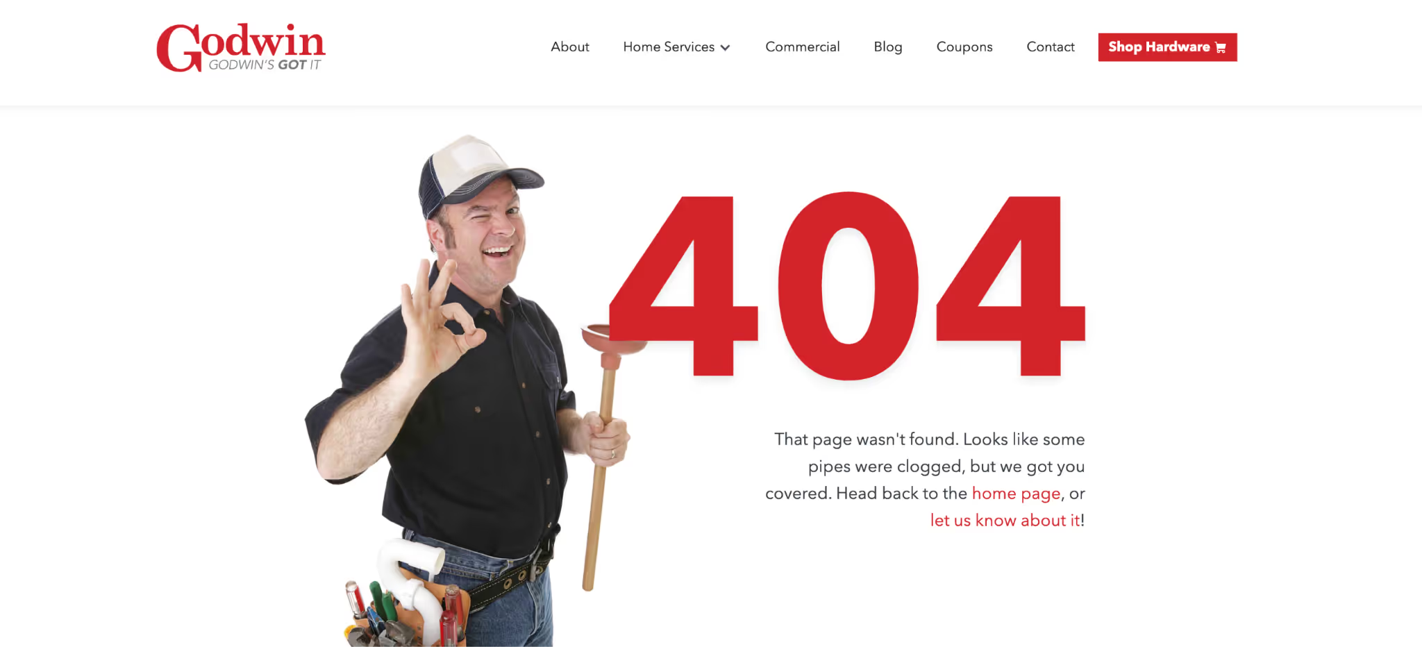
Godwin Plumbing & Hardware
Godwin’s brand is built on trust, service, and community care and on their error page, we wanted to lean heavily on the cheese factor, between the stereotypical plumber to the “pipes clogged” pun, it’s all ooey gooey cheesy.
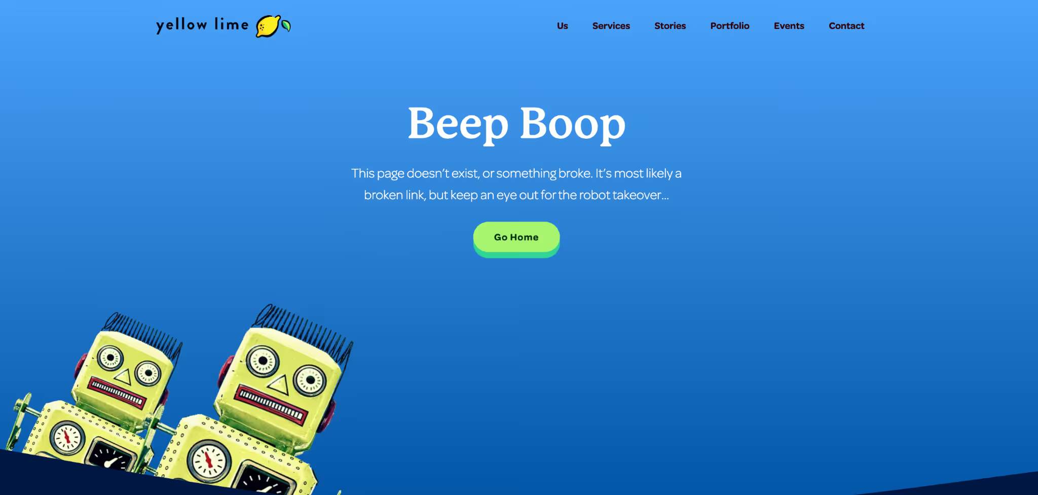
Yellow Lime Creative
We gotta close with our own, where we lean fully into playfulness.
More Stories
#ToHashtagOrNotToHashtag
Why Your Business Needs a WIG