Rebrand vs. Brand Refresh: What’s Right for You?
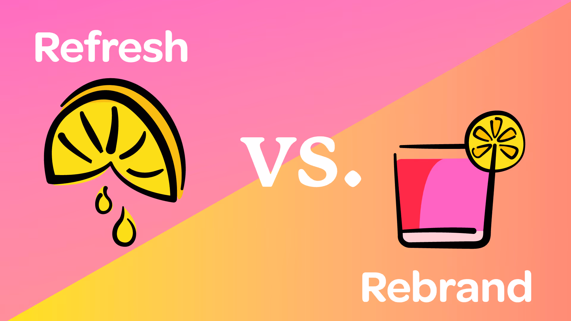

So, you’re staring at your brand like it’s wearing the wrong outfit—technically it’s fine but definitely not giving the right vibe. You know something has to change, but do you go full makeover (rebrand) or just freshen things up a bit (brand refresh)?
Let’s break it down so you can make the right move without any rebrand remorse.
Rebrand: A Full Identity Overhaul
A rebrand is like moving to a new city, changing your name, and deciding you’re a whole new version of yourself with a new wardrobe and accent. But don’t be fooled, it’s not just about looks—it’s about redefining who you are in all aspects of your business.
A rebrand makes sense if:
✅ Your business has shifted—new services, new audience, or new mission
✅ Your current brand feels outdated or no longer represents who you are
✅ You’re struggling to stand out in your industry
✅ People keep calling you the wrong name (aka brand confusion)
Rebrand Show & Tell
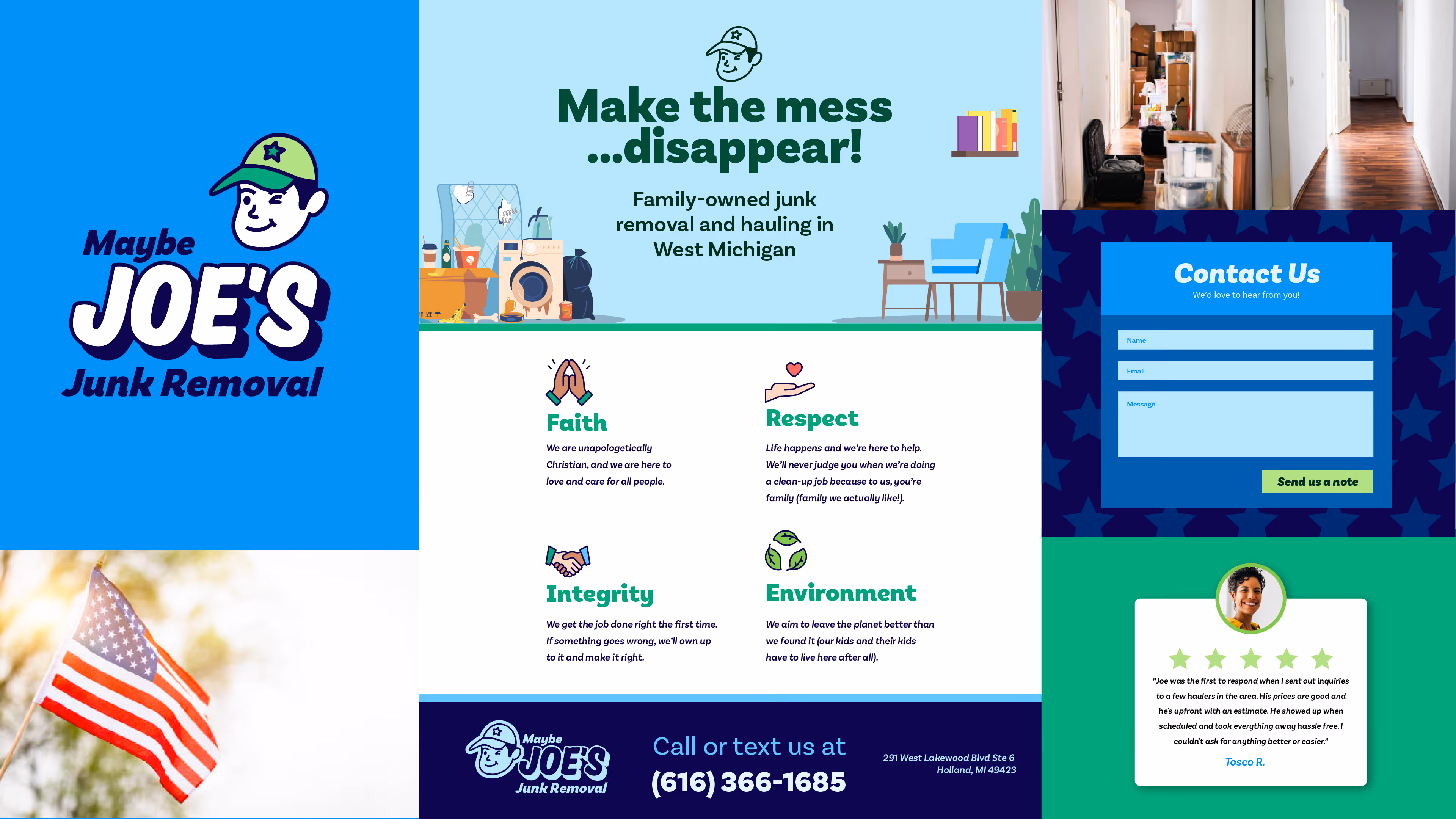
Maybe Joe’s
Maybe Joe’s is a local junk-hauling company who prides themselves on serving everyone in need with whatever they need (read more about them in this spotlight story). Their original brand was rugged, grungy, and tough.
But the visuals didn’t represent the friendly, fair, and environmentally conscious pieces of Maybe Joe’s. Maybe Joe’s was in need of a rebrand to better portray who they were. This shift helped with the voice and tone they use on their website, photos they take, and the way they are seen in the community.
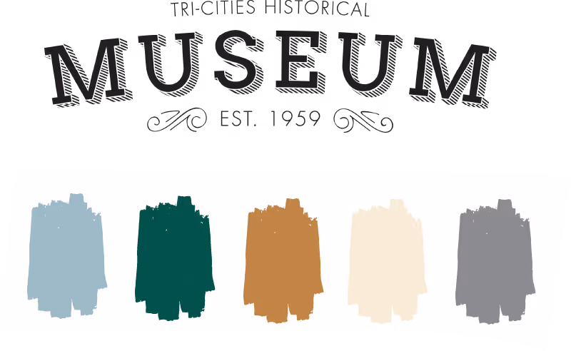
Tri-Cities Historical Museum
The Tri-Cities Historical Museum in Grand Haven had a vintage-style logo that “felt” like a museum and did match the historical colors on the outside and interior of the building. The logo wasn’t bad, but it didn’t represent their core values of inclusiveness, adaptability, stewardship, and wonder.
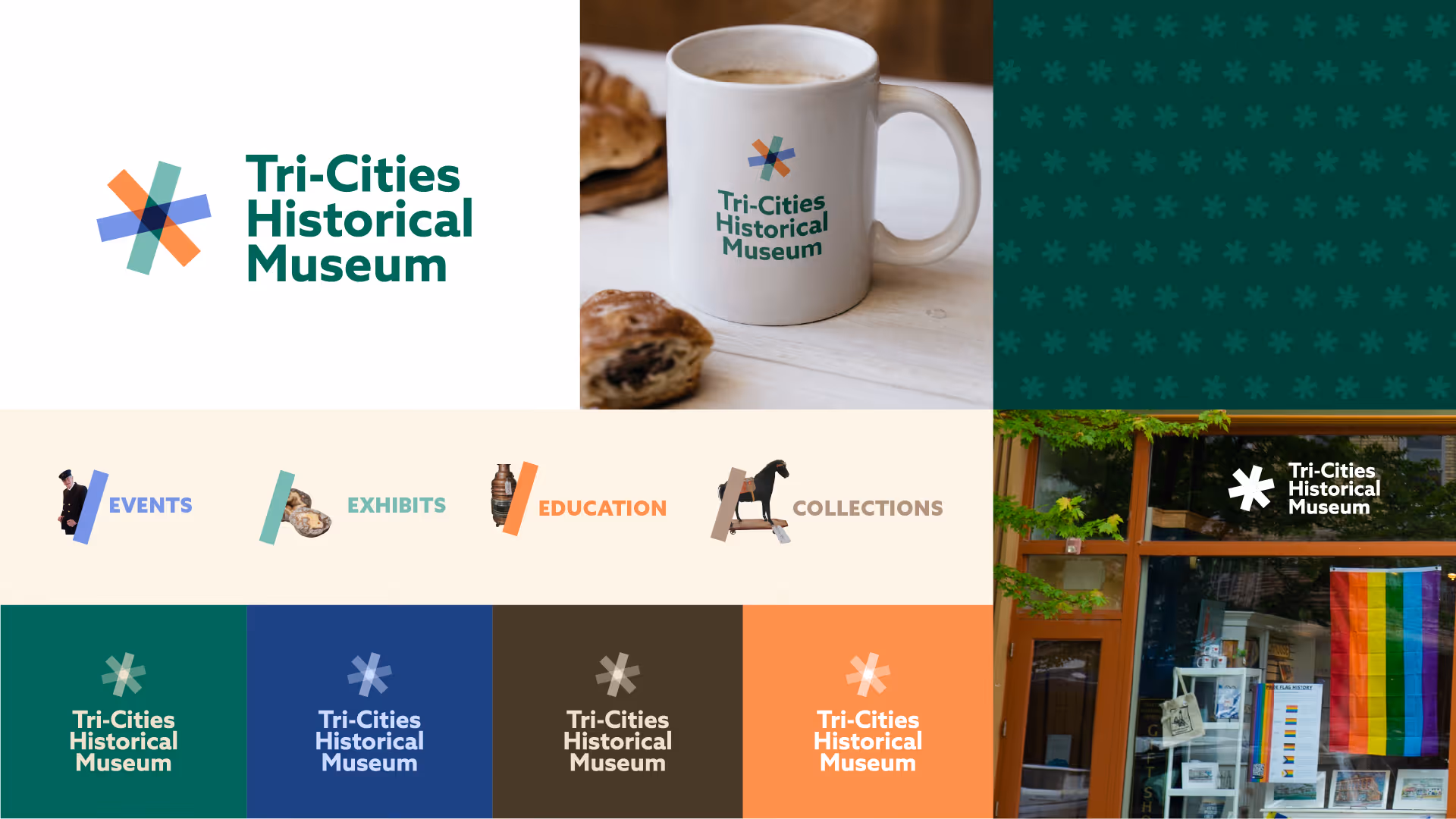
With the full rebrand, we wanted to bring their unique personality to the logo and make it more modern (just because they’re a museum doesn’t mean their branding has to feel dusty). We incorporated 3 shapes together that represent the pillars of Collections, Exhibits, and Education (or the Tri-Cities of Ferrysburg, Grand Haven, and Spring Lake) that combine and overlap to make a star or asterisk all together. The vibe is more playful, while staying rooted in the history of the Tri-Cities.
Visual Brand Refresh: A Glow-Up, Not a Whole New You
A brand refresh is like getting a new haircut and finally investing in quality jeans—it’s still you, just more polished and intentional. You’re not starting over; you’re refining what’s already working.
It’s easy to think of a brand as just a logo, but don’t forget that a brand starts with who YOU are: your mission, values, and personality. From there you make decisions about visuals and copywriting, and everything together makes up your brand.
A visual brand refresh makes sense if:
✅ Your visuals feel a little tired, but your core business is solid.
✅ You’re attracting the right people but need a more modern or cohesive look.
✅ You’re expanding (new locations, services) and need a more scalable identity.
✅ Your logo looks like it was made in Microsoft Paint (we’ve all been there).
Show & Tell
Ottawa County Department of Public Health
Ottawa County Department of Public Health had a logo and used the default government colors of red, white and blue. The fonts, colors, and layouts they were using felt dated, which didn’t feel welcoming or accessible as a community-focused organization.
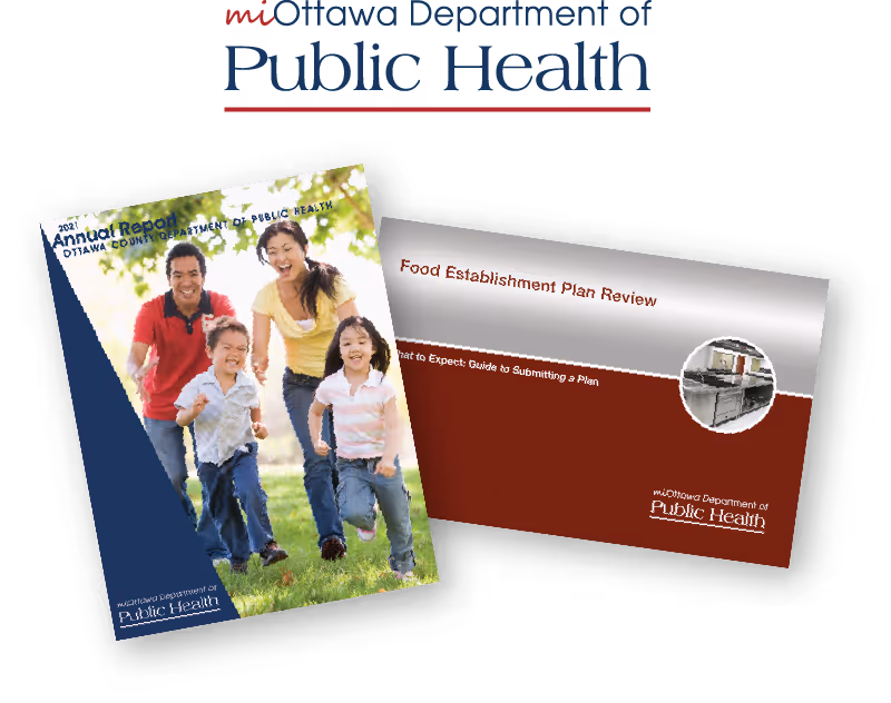
We kept the general logo layout and the blue and red, but we switched fonts out to more modern and legible fonts and added additional colors that give us more variety and feel more welcoming and friendly.
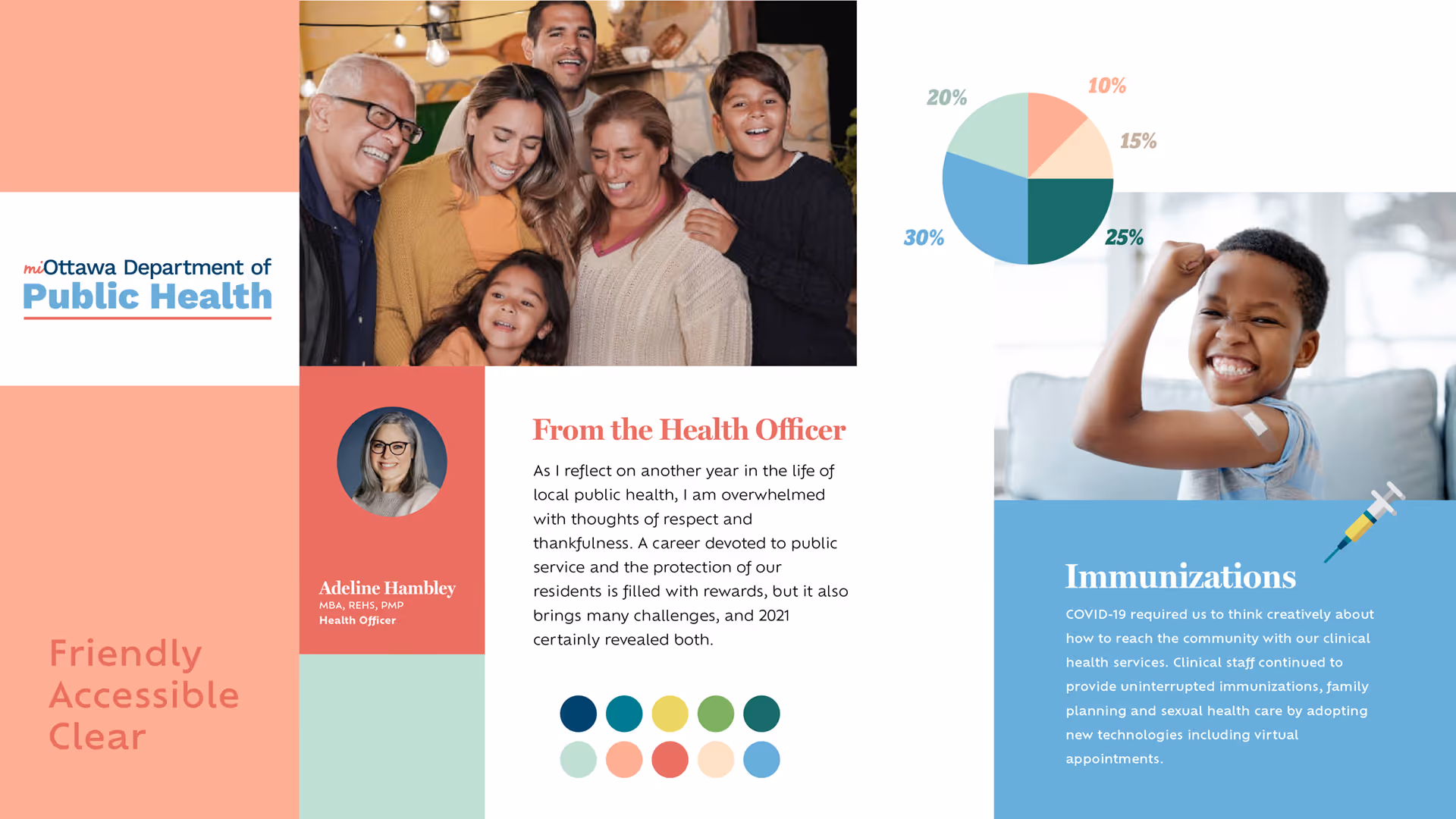
With just a few small edits and editions, we brought the County Health Department into the present and gave them a fresh, friendly, and accessible look.
Lakeshore Nonprofit Alliance
The Lakeshore Nonprofit Alliance had a logo and just two shades of blue, one shade of green, and white as part of their branding. But otherwise there weren’t any other brand elements or colors that were consistent across their marketing materials. Their colors felt soft and held-back, not in alignment with their values of collaboration, excellence, trust, inclusion, and member-driven.
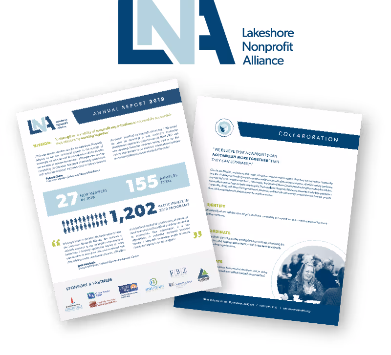
They wanted their brand to feel inspirational, inclusive, and warm. They wanted to keep their logo design, but we brightened their light blue, and added some teal and coral shades to represent their supportive vision of the West Michigan community. We also added shapes in groups that mirror the shapes of the letters in LNA but represent all different people and groups coming together to form a strong community.

How to Decide?
If your brand feels like it needs major therapy, a rebrand might be the move. If it just needs a little Botox, a refresh will do the trick.
Still unsure? That’s what we’re here for! We’ve helped businesses at every stage, from total transformations to strategic tweaks. Let’s chat and figure out what’s right for you.
More Stories

West Michigan Spots We Love
Why 404 Pages Matter More Than You Think