Brand Guide Must-Haves

Newsflash: Your brand guide is not just your logo usage, it’s the manual for how your brand shows up in every aspect.
Whether you’re a one-person operation or a full team, a brand guide helps everyone stay consistent, cohesive, and on-brand (even when you’re juggling fifteen things at once). Here’s some items we believe deserve a spot in every brand guide:
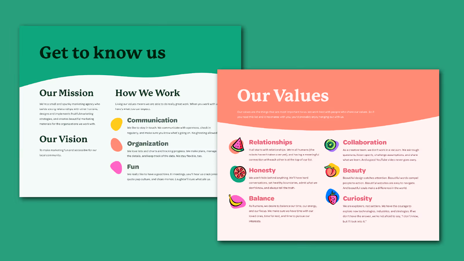
- Mission, Vision, and Values

This is the heart of your business: your “why,” the reason you exist, where you’re headed, and what you stand for. Your mission and vision give you a goal to reach for, acting as your north star, while your values keep you grounded, serving as your moral compass.
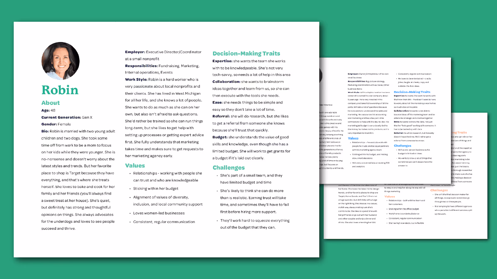
- Marketing Personas

Your service or products aren’t for everyone. (And that’s a good thing.) Defining your audience through personas (sometimes called avatars) helps your messaging connect instead of getting lost in the noise. A few personas make it easier for anyone working with your brand to write, design, and plan content that strikes the right chord with your ideal customer every time. Need help getting started? Check out this write-up: Become Besties With Your Personas 🍋
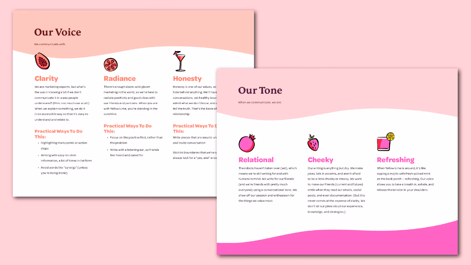
- Voice and Tone Guide

This section is your brand’s personality in written form. Whether you’re educational and professional or warm and cheeky, your voice always stays the same, even when your tone shifts. This section of your brand guide might include additional items like your key messaging pillars, words and phrases you use (and ones you avoid). Want some extra guidance? Check out this write-up: Honing Your Unique Voice & Tone 🍋
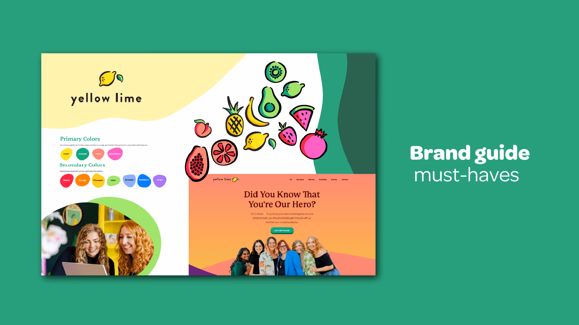
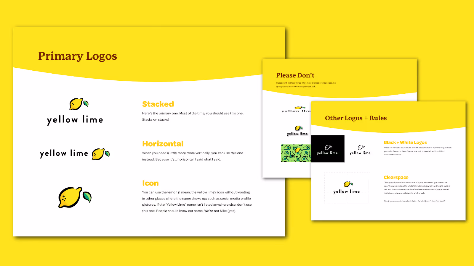
- Logo Usage & Application
buddy Your logo is an important part of your identity; be sure to respect it. In this section, you need to show how your logo should (and should not) be used, including minimum sizes, clear space, background rules, color variations, and what to absolutely avoid (like stretching it to fit a weird shape). This is also a great place to mock up your logo in various applications to show how it can be used in the physical world (window clings, pens, stickers, mugs, etc.)
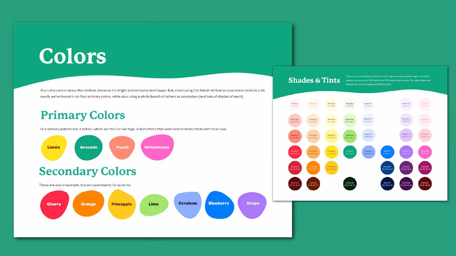
- Color Codes and Usage
.gif)
While we love color (duh), even we have rules for which colors we use over and over and how to use them. Be sure to add each color’s HEX, RGB, and CMYK codes, and include any contrast rules or color pairings.
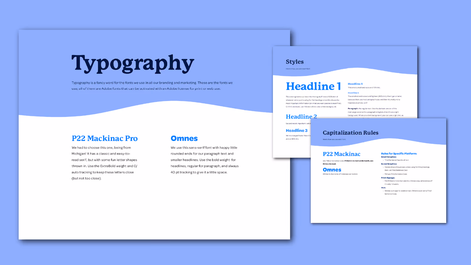
- Typography
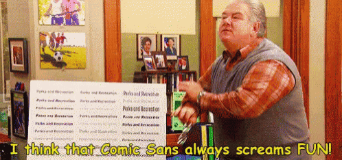
Fonts carry personality. (Comic Sans, for example, is fun, but is also very childish and unprofessional.) Make sure to define your heading, subheading, and body fonts, plus where and how they’re used. Consistent typography keeps your brand polished and professional. Hot Tip: Your primary fonts for documents, design, and web don’t have to be the same as your logo font.
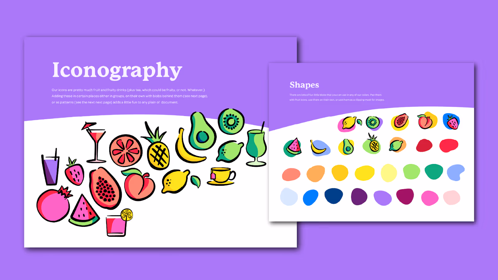
- Additional Design Elements

Iconography, patterns, and shapes, oh my! All of the extras are the small details that make your brand feel like you. Too often, organizations stop thinking about their branding after their logo, colors, and fonts are chosen, but there’s so much more to creating a cohesive brand look. Think patterns, icons, illustrations, or graphics. These can be used in so many different applications and each time reminding your audience it’s you at first glance.
- Photography Style

Photography isn’t just about pretty pictures, it’s an immediate visual to help your audience recognize you. Outline your preferred style (candid, bright, moody, minimal, color-toned, etc.), editing preferences, and what kinds of subjects or scenes best represent your brand’s personality. Need help getting the light just right? Check out this write-up: Let’s Keep Things Light 🍋

Your Brand = You
A great brand guide is like your brand’s cheat sheet. It should be clear enough that anyone on your team (or future team) can stay on-brand without guesswork. When done right, it keeps your visuals and your voice consistent so your audience always knows it’s you, whether they’re scrolling your Instagram or opening your latest email.
More Stories

West Michigan Spots We Love
Why 404 Pages Matter More Than You Think