Bouba vs. Kiki
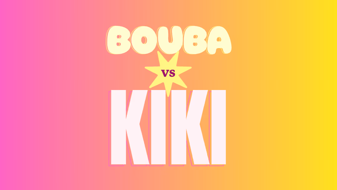

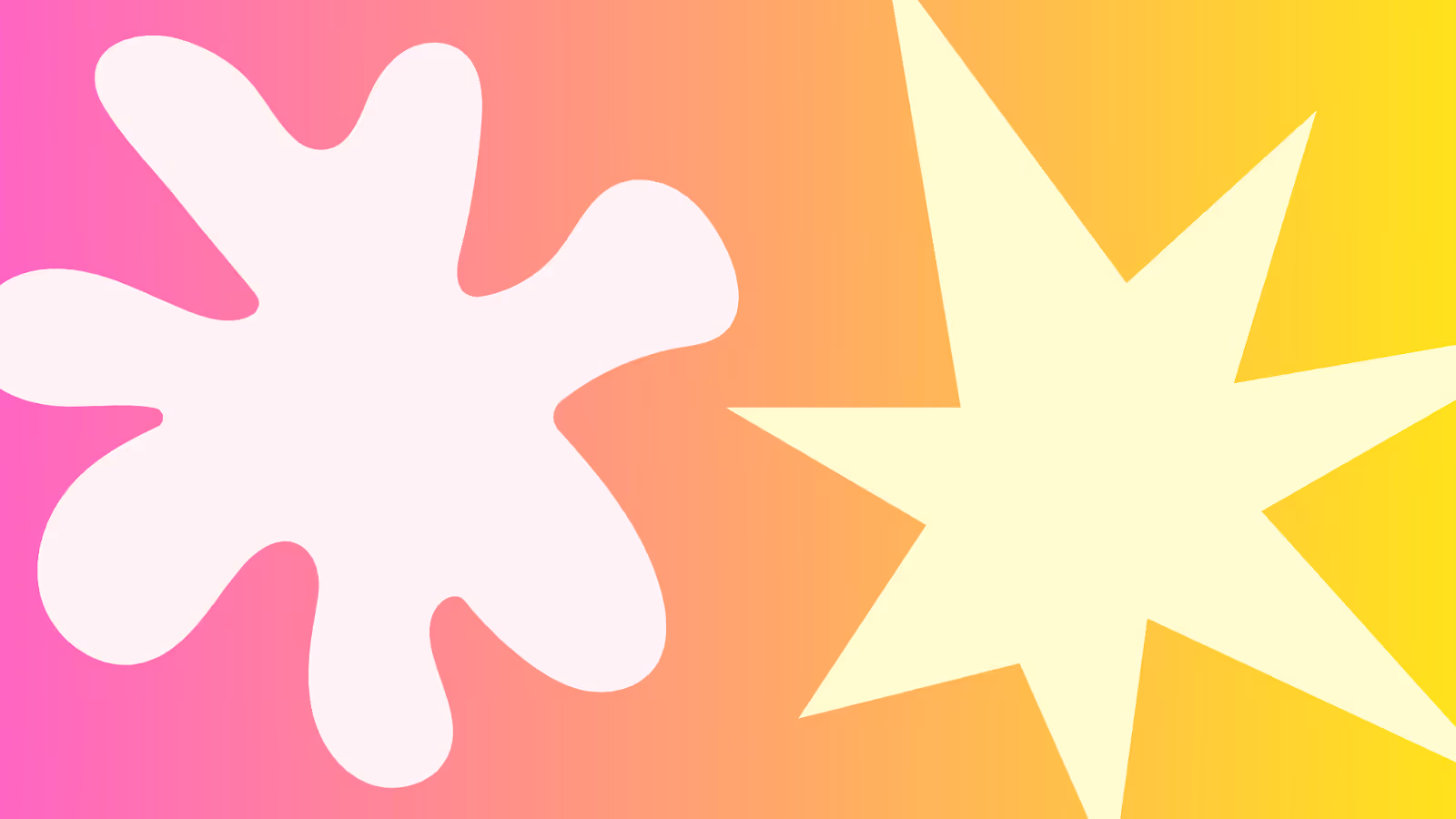
Now—without overthinking—tell us: which one is Bouba, and which one is Kiki?
If you pointed to the rounded shape and said Bouba and to the sharp shape and said Kiki, congratulations! 🎉You’re in the 95% of humans who instinctively make the same choice. That gut feeling you just had? That’s called the Bouba-Kiki Effect, and it’s a fascinating peek into how our brains link sounds, shapes, and emotions.
The Science-y Bit (But Make It Fun)
Back in 1929, psychologist Wolfgang Köhler ran an experiment with shapes and nonsense words on people in the Canary Islands. He found that the majority of participants matched soft, rounded shapes with softer-sounding words like Bouba and sharper, angular shapes with harsher-sounding words like Kiki.
The reason? Our brains naturally connect sensory cues. Soft, rounded shapes are easier to pronounce with rounded mouth shapes—your lips form a soft “ooo” with Bouba. Angular sounds like “k” or “t” mimic sharp edges—they’re abrupt, with quick stops in airflow. It’s a bit like synesthesia (where senses cross over), but instead of seeing colors when you hear music, you’re mapping sounds to visuals without even realizing it.
Bouba and Kiki in the Wild
Once you see it, you can’t unsee it. The Bouba-Kiki Effect is everywhere in branding and media:
Bouba (curvy line) Examples:
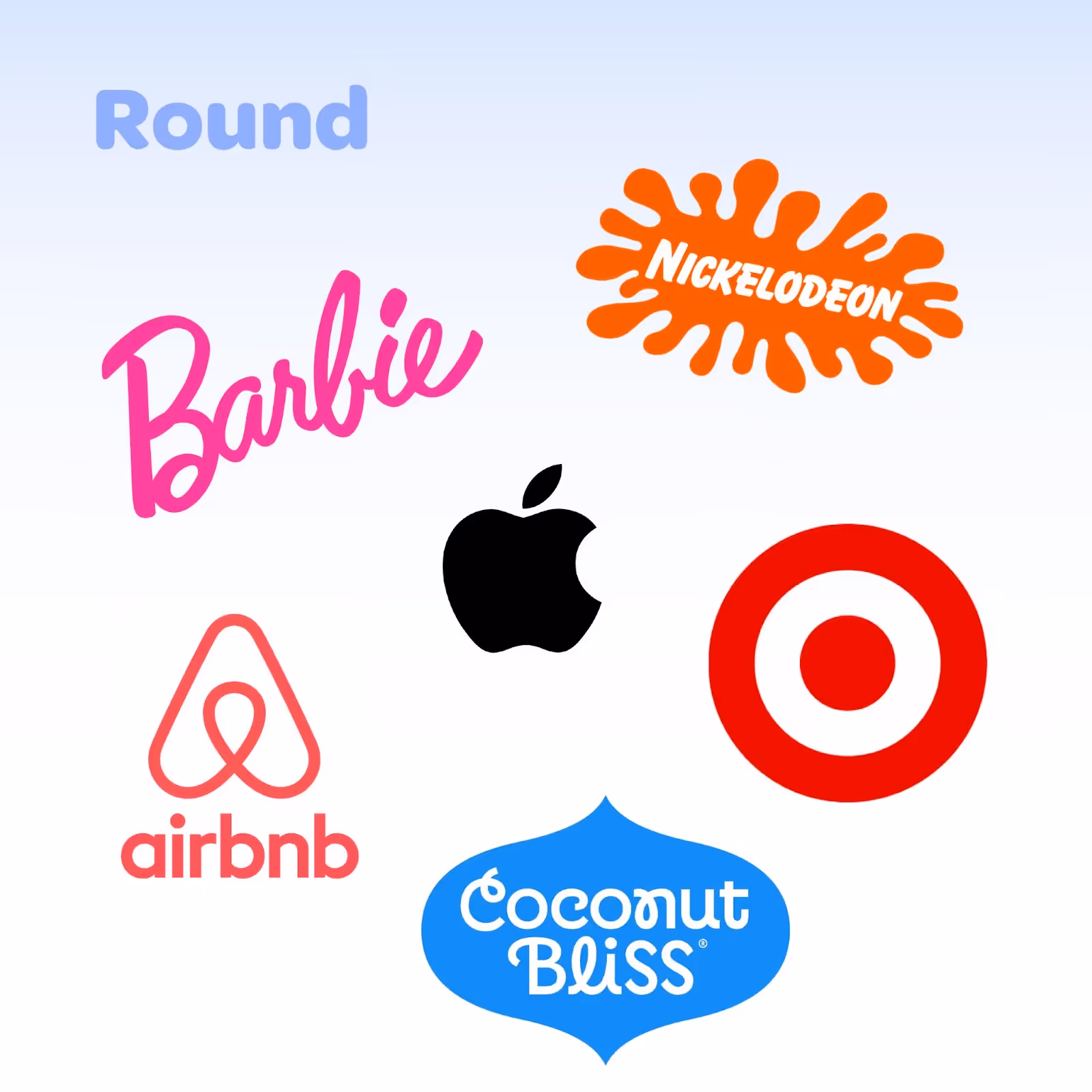
- Barbie Logo – Flowing script, rounded letters, smooth lines.
- Target Icon – A literal circle? Say less.
- Airbnb Logo – Playful curves, whimsical loops, and rounded lettering
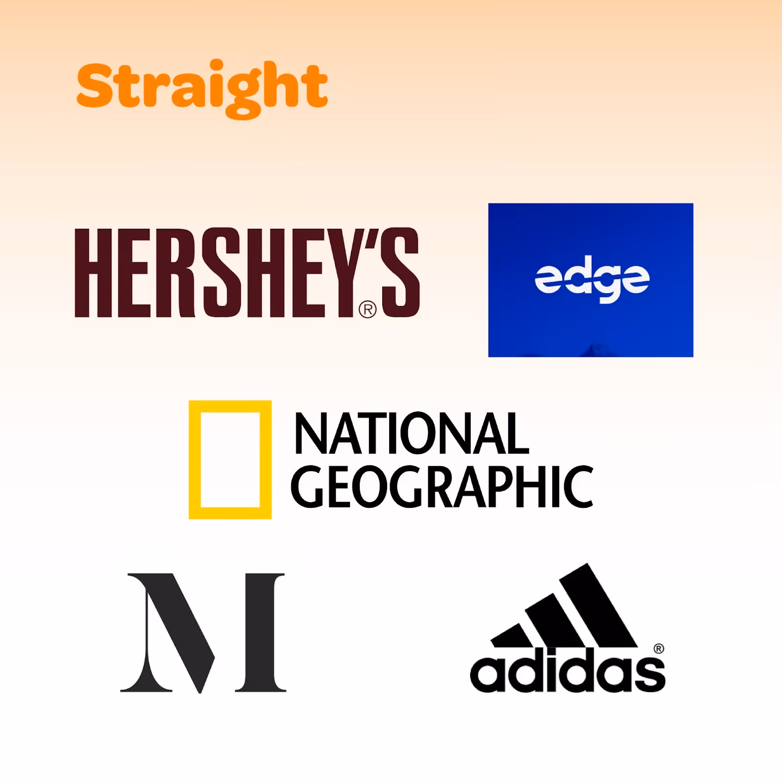
Kiki (straight line) Examples:
- National Geographic Logo – Sharp line-based font, literal rectangle for brand mark
- Adidas Logo – Bold, angular mark with clean lines (note the font is totally bouba though!)
- Hersey’s Logo – Geometric and hard-edged.
Even movie characters follow the rule. Think about Finding Nemo: the friendly sea turtles are round and smooth (Bouba vibes), while the barracuda at the beginning? All jagged teeth and pointy fins (Kiki energy).
How This Applies to Your Brand
Shapes and sounds carry emotional weight. When someone encounters your logo, typeface, or even the shape of your packaging, their brain starts making connections before they’ve even read the words or used the product.
Bouba shapes tend to feel:
- Friendly
- Approachable
- Safe
- Comforting
These are great for brands in hospitality, wellness, food & beverage, or anything that wants to feel warm and welcoming.
Kiki shapes tend to feel:
- Bold
- Dynamic
- Cutting-edge
- Intense
These are great for tech companies, sports brands, or anyone who wants to project energy, innovation, or a little bit of edge.
Do You Have To Pick One?
When to Be Consistent
For your day-to-day branding, consistency is your best friend. Your logo, main color palette, typography, and core imagery should stick to one visual “personality” so customers know exactly what to expect.
That means if your main brand identity is Bouba, your core materials (business cards, social templates, signage) should lean into curves, rounded corners, and softer color gradients.
Alternatively, if your brand is Kiki, keep those angles crisp, your lines clean, and your typography sharp.
This kind of consistency helps your audience recognize you instantly, which builds trust over time.
When to Break the Rules
Here’s the fun part: you don’t always have to play by your own shape rules. In fact, breaking away from your norm can make specific campaigns pop.
Example:
- A Bouba brand like Innocent Drinks might go Kiki for a limited-edition energy drink launch. Picture spikier typeface, bold colors, etc. This will signal something “new” and “high-energy.”
- A Kiki brand like Nike might use Bouba-style ads for a community-based or charitable campaign to feel warmer and more human.
By intentionally shifting shape styles, you create contrast. Your audience will feel that something is different—and that’s the point. It’s a visual way of saying, “Hey, pay attention, this isn’t our usual vibe.”
Your Bouba-Kiki Homework
Take a look at your logo, website, and social feeds. Which camp do you fall into—Bouba or Kiki? Does that match the personality you want your audience to feel?
If your shapes and sounds aren’t lining up with your brand’s core emotions, it might be time for a visual tune-up.
The Bouba-Kiki Effect isn’t just a quirky psychology trick—it’s a reminder that humans are wired to respond to subtle cues. And in branding, those subtle cues are your secret weapon.
More Stories

West Michigan Spots We Love
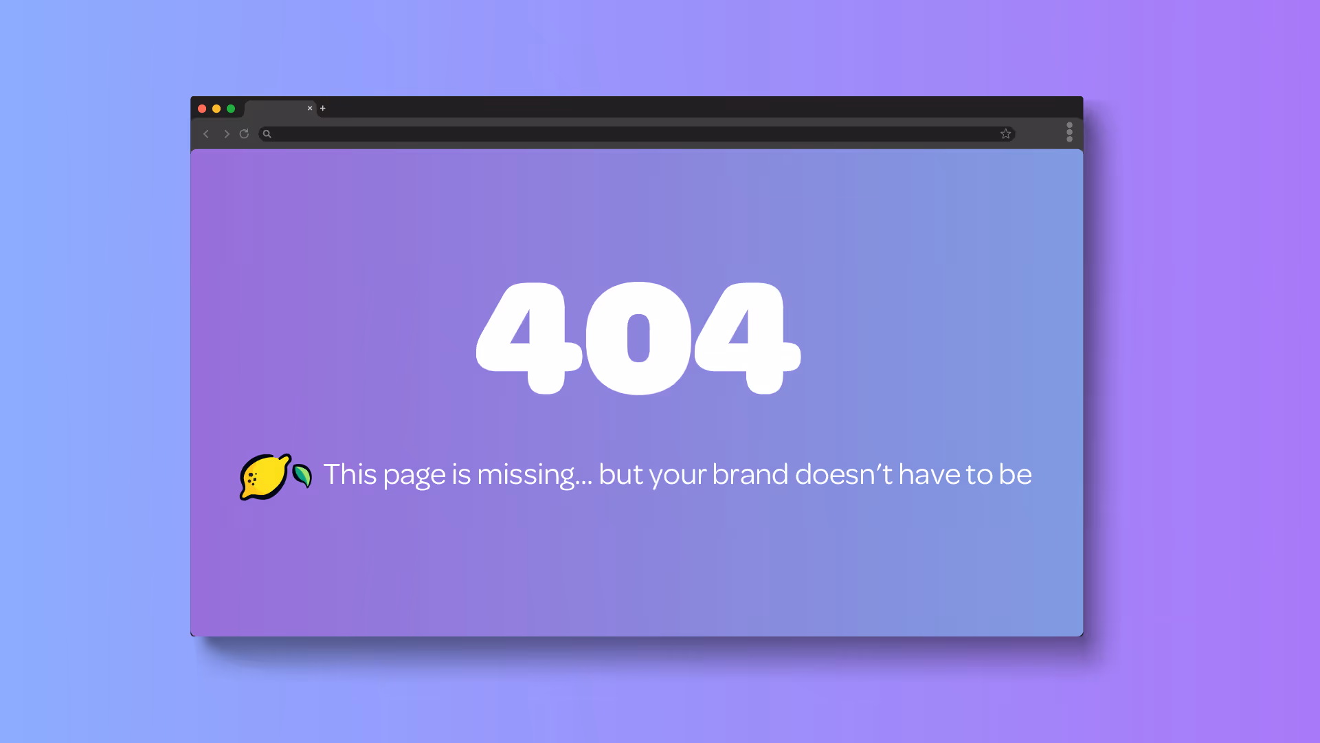
Why 404 Pages Matter More Than You Think