
Brand Refresh & Program Identity for Nonprofit
Project Snapshot
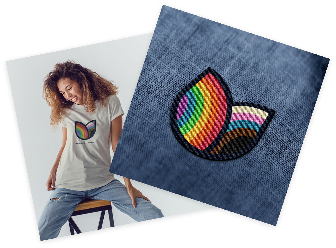
Out On The Lakeshore (OOTL)’s brand had served them well for years, but it was time for something more modern, more bold, and more reflective of the full community they serve. Their existing logo used a standard rainbow that didn't capture the breadth of the progressive pride flag or the energy of the organization they had grown into.


Client Overview
Out On The Lakeshore is a nonprofit serving the LGBTQ+ community on the lakeshore of West Michigan, providing programs, resources, and community connection for people of all ages and identities.
OOTL came to us ready for a brand that matched who they are today. With a growing roster of programs and a community that deserved to see themselves reflected in every detail, they needed more than a logo update. They needed a full identity system that could flex across programs while staying unmistakably cohesive.
Project Goals

Full Inclusivity
Update the visual identity to reflect the full spectrum of the progressive pride flag and the diverse community OOTL serves.

Modern & Bold
Move away from a dated look toward something with energy, intention, and staying power.

Identity That Scales
Build a brand flexible enough to extend across multiple programs, each with its own identity, while staying rooted in the overarching brand.
Here's What We Did
We started with a discovery meeting to dig into OOTL's goals, audience, and vision for the refresh. From there, we developed a few brand directions for them to choose from, ultimately landing on a concept that brought together bold color, modern design, and deep intention.

Brand Refresh
The updated logo brings the full progressive pride flag into the mark in a way that feels purposeful rather than performative. Every color choice was intentional, honoring the breadth of identities within the LGBTQ+ community while giving OOTL a look that's confident, vibrant, and built to last. We delivered a complete logo system, including all lockups and color variations.
Program Identity System
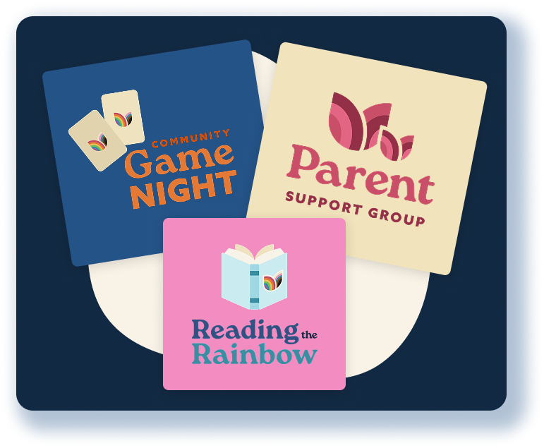
From there, we extended the brand across six program logos, each with its own distinct personality and color story while remaining unmistakably part of the OOTL family. Each logo was designed to stand on its own while reinforcing the larger identity.

Templates for Continuity
To set the OOTL team up for success, we created social media and email templates so they could hit the ground running with the new brand on their own.
Follow-Up
Why It Worked
A Brand That Reflects Everyone
The new identity doesn't just nod to inclusivity—it embeds it into every detail, giving community members a brand they can genuinely see themselves in.
Cohesion Across Program Suite
Six distinct program logos, one unmistakable family. The identity system gives each program its own voice without losing the thread back to OOTL as a whole.
Ready-to-Use Materials
By delivering templates alongside the brand, OOTL walked away with the tools to maintain consistency long after the project wrapped.

When your brand needs to reflect everyone you serve, we'd love to help you get there.