
Vibrant Fundraising Event Design Package
Project Snapshot
Cherry Health Foundation's annual Cherry Health Celebration had a strong tradition behind it, but the event's visual identity was ready for a refresh. They came to us looking for a look that matched the energy of the evening and gave the event its own moment to shine.

Client Overview
Cherry Health is a nonprofit healthcare organization serving the Greater Grand Rapids community across more than 20 locations, providing accessible primary care, dental, behavioral health, vision, and more; regardless of a patient's ability to pay. Cherry Health Foundation is their fundraising arm, supporting that mission through community events and giving.
Every year, the Cherry Health Celebration brings together donors, community members, and healthcare advocates to support a mission that matters. When the Foundation came to us for a full event redesign, the goal was clear: honor the Cherry Health brand while giving this specific event its own distinct identity. The goal was for visuals that felt celebratory, elegant, and full of energy.
Project Goals

Fresh Energy
Evolve the event's visual identity to feel current, vibrant, and worthy of the occasion.

Brand Harmony
Complement Cherry Health's existing visual identity without being constrained by it and giving the event its own moment to shine.

Cohesive Experience
Ensure every touchpoint, from the first mailer to the final slide, feels intentional and unified.
Here's What We Did
We kicked off with a homework assignment for the client to gather insight into their brand, audience, and vision for the refresh. Armed with that context, we developed two distinct visual moodboards for the Foundation to choose from, giving them creative direction and a clear path forward. They selected the concept that became the foundation for everything that followed.

Design Direction
We intentionally selected a color palette that complemented Cherry Health's existing visual identity while giving the event its own distinct moment to shine. Leaning into bold reds from the organization's brand, we layered in fresh complementary tones and dynamic design elements to create a look that balanced elegance with energy to capture the heart of a meaningful celebration while adding just the right dash of fun.
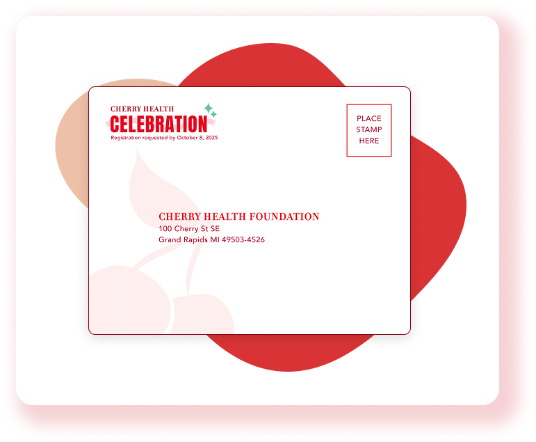
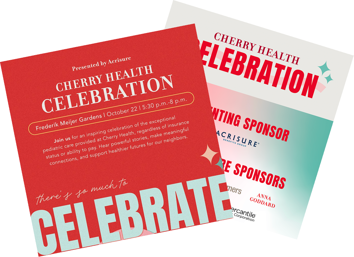
Invitation Suite
With the design direction approved, we created a fully custom mailed invitation suite, including the invitation itself, a matching custom envelope, an RSVP card, and a return envelope. Every detail was considered so that the first impression, before guests even arrived, felt special.

Event Materials
From there, we extended the design across the full suite of event assets, including: giving materials, sponsor banners, an event program booklet, PowerPoint templates for the evening's presentation, and additional event materials.
Follow-Up
Why It Worked
Cohesive Experience
From the moment the invitation arrived in the mail to the final slide of the evening, every touchpoint shared the same look and feel, which created an experience that felt polished and purposeful from start to finish.
Energy Matched
The final creative struck the balance the Foundation was looking for: rooted in the Cherry Health brand but elevated for the occasion, with enough warmth and boldness to make the night feel truly celebratory.
Ready-to-Print Materials
The Foundation walked away with a complete, event-ready suite with every asset designed, formatted, and prepared for production so their team could focus on the event itself.
Whether it's an annual gala or a first-time fundraiser, we'd love to help your event look as good as the cause behind it.